Valleywise Health
Increasing accessibility to Valleywise's vast range of healthcare services in the Arizona Valley through a website redesign that will effectively support their patient-first audience and mission.
role
UX Strategy
- Information Architecture
- UI/UX Design
- Design System Management
- User Research & Testing
collaborators
- UX Design
- Brand Strategy
- Design
- Development
- Copywriting
- SEO & Analytics
company/year
- Highnoon
- 2019 – 2021
problem
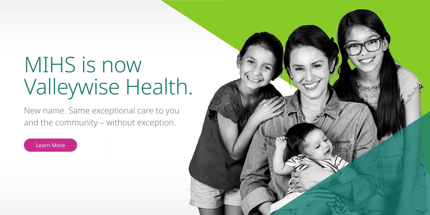
Maricopa Integrated Health System (MIHS) has been providing inclusive, quality care to the county for 140+ years with a vast range of healthcare services to underserved communities, but carries the stigma of the ‘county hospital’ and has a website experience that doesn't reflect patient needs.
solution
Create a new healthcare experience on the website to reflect Valleywise’s new visual identity, give the site a patient-first approach, drive traffic to book appointments, and help users establish a long-term relationship with the brand.
impact
+52%
new website users
+42%
website sessions
+33.17%
YoY appointments booked
overview
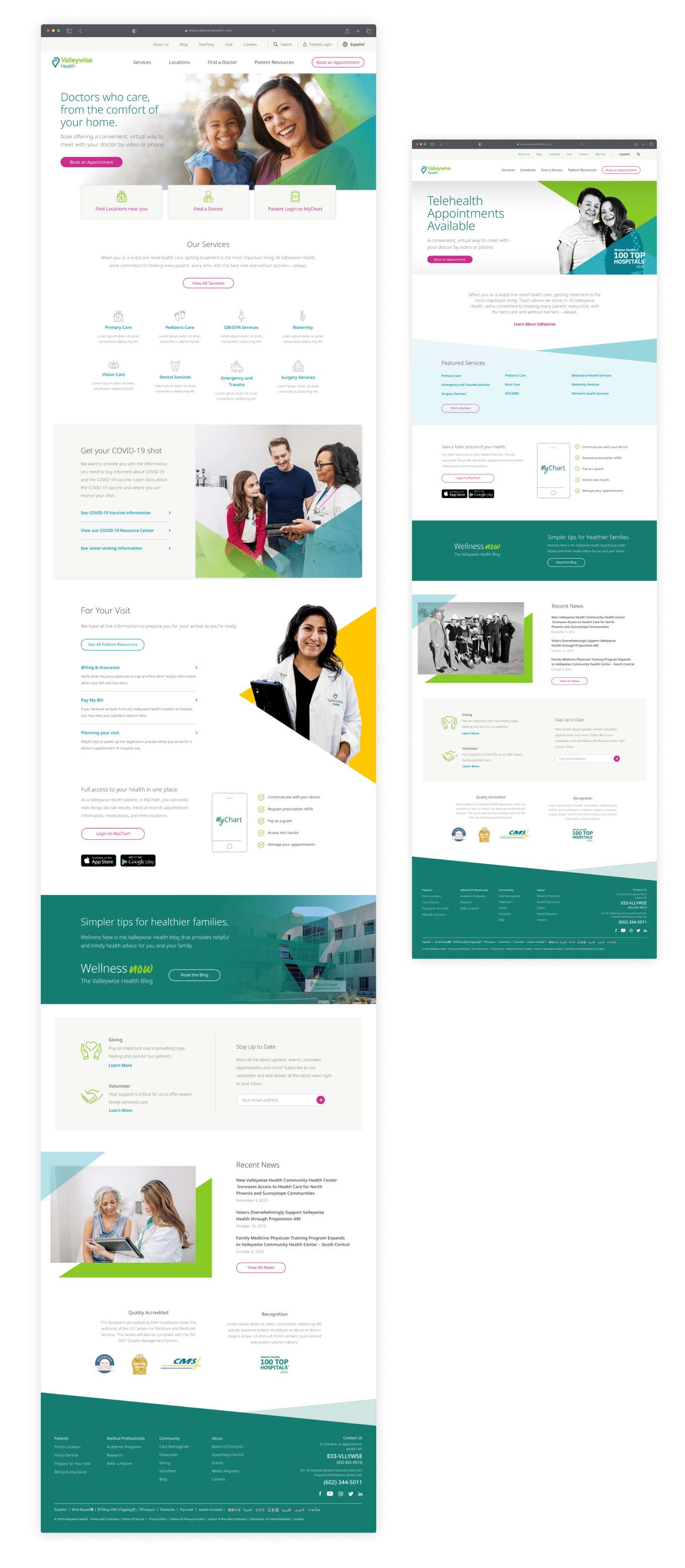
My team and I initially created the new Valleywise Health website as an overhaul of MIHS' old identity, but because the scope of our discovery and research was constrained to competitive research and stakeholder interviews, we knew we had to take it further past the redesign with additional user research, to truly elevate the new brand and reflect the patient-first experience that was a part of the Valleywise Health mission.
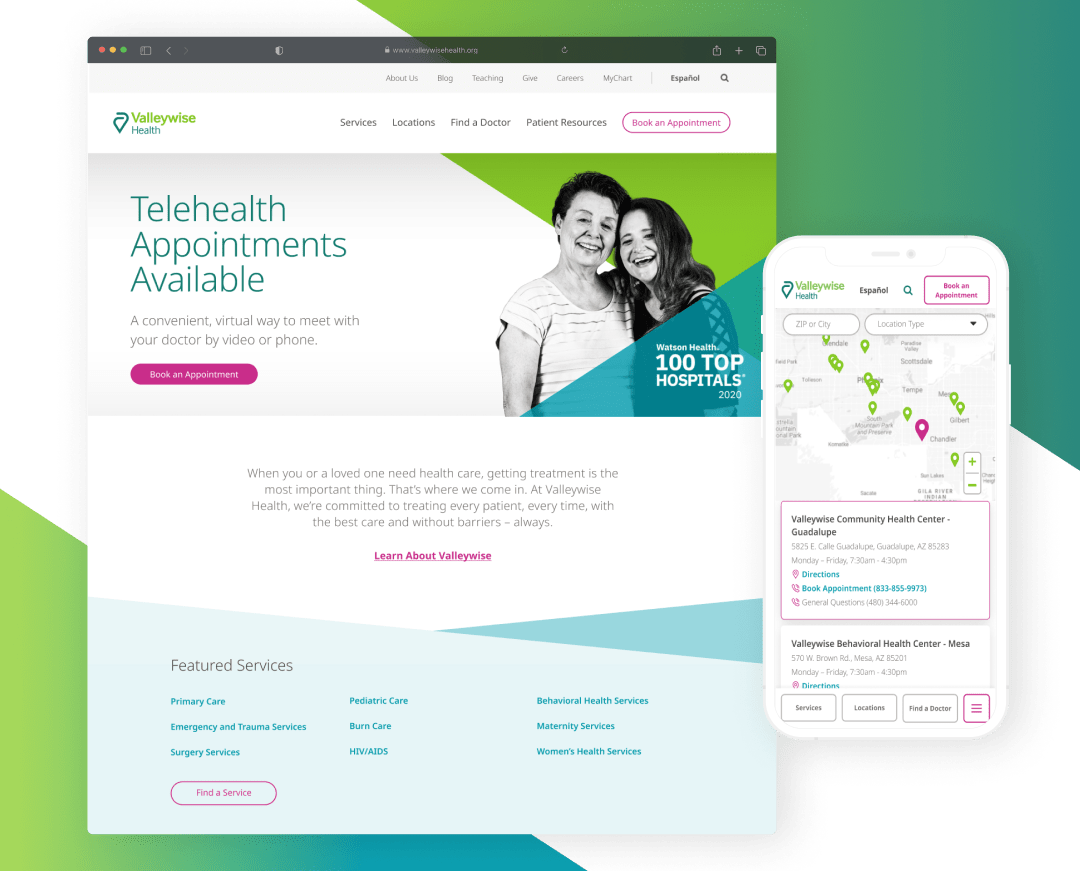
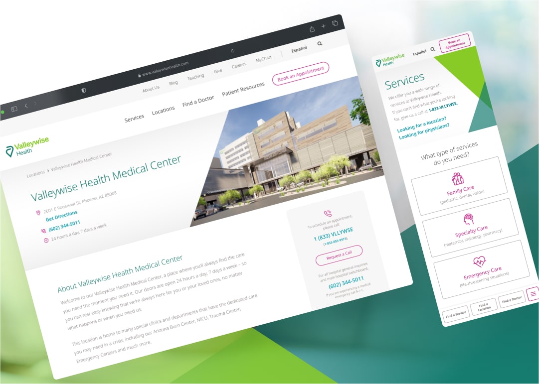
New Valleywise Health website
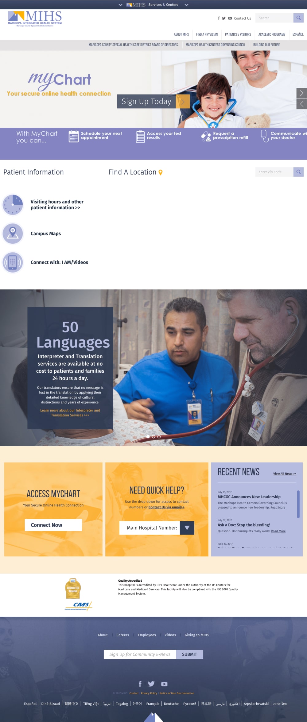
original MIHS.org
01 initial website redesign
Understanding the current experience
01
What are audience objectives on the site?
02
What are the website/stakeholder objectives for the site?
03
What does success look like in this redesign of the website?
04
What can be improved compared to competitor healthcare websites?
stakeholder interviews
Interviews were conducted with stakeholders to gather intel on overall patient pain points and feedback on the current MIHS site and to understand the baseline experience. We found that:
- The site focuses on the organization, rather than the needs of the patients that go there.
- Content doesn't communicate the differentiators of the organization or why it is different
- Unclear navigational paths with key information buried pages deep
- Booking an appointment online as a new patient was not a straightforward experience
site and competitor audit
A comprehensive audit on the MIHS site was performed to see what what could be improved. We also looked at direct healthcare competitor websites – both local and national – to learn about their features, design patterns, and user experience. These are some of the top competitors that we reviewed in our analysis.
Mayo Clinic
Has the best content marketing strategy to learn from.
They do a great job serving up content that is educational and user-focused, which also leads to the most organic traffic and being positioned as a leader in the healthcare space.
Banner Health
Leads when it comes to patient user experience.
They lead with only patient-centric needs and messaging, allowing the most important audience to get what they need quickly. Such a targeted approach also makes their brand more reputable for their mission overall.
Phoenix Children's Hospital
Does the best job living out their brand on the website.
You get a visual experience of the brand, similar to that of walking into the physical hospital. This gives the user a great start in building a long-term relationship with the brand across consistent touch points.
Cleveland clinic
Most-needed patient resources are clearly highlighted with two pathways for Patients and Doctors right up front – leading users to their intended user flows right away from the homepage.
Supporting homepage content allows for various features for various audience.
insights
01
Call-to-actions + site content
Intuitive and clear user paths and calls-to-action in the navigation and throughout the pages to allow a cohesive user journey throughout the site (clear destinations, etc.)
02
Brand experience + design
Visually communicate the brand, the organization’s mission, and the in-person patient experience
03
Content + integrated marketing strategy
User-centric and educational content to: deliver needs quickly; support the mission; and establish organic traffic, brand positioning and thought-leadership in the healthcare space
04
Audience-Specific Sections
Organized and targeted content for self-identified audience segments.
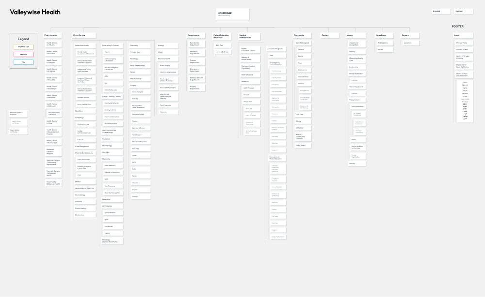
sitemap
In restructuring the information architecture, we wanted to create much clearer labelling in the navigation to indicate the intended user paths for each audience.
Patient-Focused Content
Quick and easy access to doctors, locations, and services with colloquial Spanish to be conversational and inviting rather than technical/formal.
- Prospective Patients
- Clear paths to book an appointment and find a service, location, doctor
- Show/communicate a clear difference between Ambulatory Care, Nonemergency hospital, Specialty
- Organization reputation: Awards and recognition, patient testimonials
- Access to required forms
- Current Patients
- Clear access to MyChart (Health Records, Lab Reports, appointment scheduling)
- Find/contact Valleywise locations and find services offered at locations
- Find a doctor (by name, specialty, location)
- Insurance & Billing + AHCCS information
- News & Updates
Audience-Specific Sections
Organized and targeted content for self-identified audience segments.
- Patient Visitors
- Find a location and contact info
- Find info on procedures
- Find my patient
- Visiting hours
- Learn about discharge procedures
- Physicians / Medical Professionals
- Physician directory + patient referrals
- Community members / Prop 480 supporters
- Potential employees
- Stakeholders
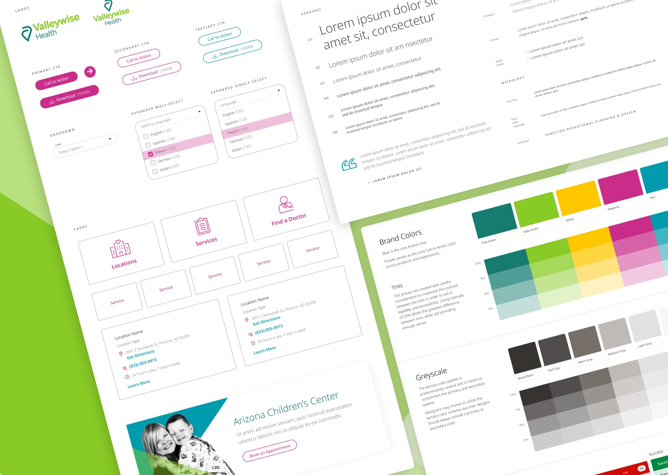
design system
Optimize the site's visuals, content and flow/navigation to be patient-centric
The new design system is an extension of the new Valleywise Health brand, a direct representation of the brand that was built by Siegel + Gale, the international branding agency hired aspart of Care Reimagined to re-brand MIHS.
The system is built on ample white space, promoting clean and uncluttered layouts; a photography style reflecting the diverse community; and bold, yet flexible overlapping triangle elements that reinforce the concept of the logo's "embrace."
After the “MVP” version of the website was launched with a constrained budget and timeline, we then focused our efforts and acquired funding for user research to truly drive a patient-first approach – and to later test and iterate upon our design decisions.
02 user research
Building lightweight personas from on-site interviews
Once the Valleywise Health re-brand and website launched and we were able to understand baseline performance, we wanted to continue to understand how our audiences perceived our brand experience-wise and visually.
01
Inform the messaging strategy between different audiences
02
Understand current and new patients’ from an attitudinal and behavioral perspective
03
Establish a baseline of the customer journey through various brand touch points
04
Screen participants for Website Usability Testing and shape research questions
RESEARCH QUESTIONS
We conducted on-site interviews at various Valleywise Health clinics to understand current and new patients’ from an attitudinal and behavioral perspective and establish a baseline of the customer journey through various brand touch points.
frequency and nature of visits
- Do they go for all of their healthcare needs or only come into the clinic?
- How frequently do they come in?
value/needs in their healthcare experience
- What do they value or need?
- What’s the most important aspect of their relationship with their healthcare provider?
- Why did they choose Valleywise over other healthcare organizations in the area?
- How did they hear about Valleywise?
history/relationship with Valleywise
- How long have they been patients?
- What other healthcare organizations in the area are they familiar with or have been to?
- Why did they choose Valleywise over other healthcare organizations in the area?
- How did they hear about Valleywise?
Motivations/Barriers to booking an appointment or coming in regularly
- How important are friends and family’s opinions when deciding on health care providers?
- What motivates them to come in – either regularly or for the first time or one time)?
Personas v1.0
Initial general patient and new patient personas
The Brand and User Experience team then segmented the data to gather insights for persona creation. These are high level descriptions of the major personas.

"Location" Lee
Lee found Valleywise Health through multiple different sources including their insurance company, online search and from friends and family. Lee cares about the quality of care, but most importantly, at a location nearby.

"Convenient and Affordable" Alex
Alex found Valleywise Health through referrals from family and friends or through insurance. Along with affordability, a quality experience and convenience are major factors in his decision when choosing a provider.

"Referral" Riley
Riley’s family and friend’s opinion when it comes to healthcare is the top deciding factor in choosing Valleywise, but she also cares about a quality experience and competent health providers.
“Qualified Doctor” Dakota
Dakota found Valleywise Health through insurance/medical coverage or online. When searching for a provider, the availability of qualified and caring physicians, as well as insurance coverage, is top of mind.
user journey mapping
A visualization of the patient journey
Mapping helped my team and I to picture the mental and emotional process of the various different patient types while booking an appointment.
This uncovered opportunities to improve various customer service touch points, and also showed a gap in the journey – the website experience, which is a key driver in decision-making as it needs to be an intuitive and user-friendly process of finding a location, doctor or service.
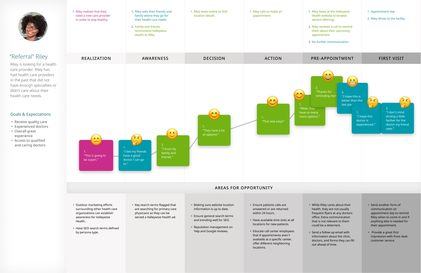
A website usability testing plan and a recruitment strategy was created from this baseline data, which we understood would evolve after testing.
03 website usability testing
Uncovering user behaviors and attitudes to inform and prioritize design iterations on the Valleywise website
Our testing plan was framed to understand key aspects of the website experience and overall brand awareness and knowledge.
hypothesis
- Current patients rarely, if at all, use the Valleywise website to book appointments
- Our insights will mainly come from potential/non-patients
process
Screening and Recruitment
A survey was sent out to Maricopa County aimed to meet the personas of prospective Valleywise patients, that asked screener questions including: age, household income, marital/child status, and what was most important when choosing a medical provider.
For the Spanish-speaking recruitments, we trained a Valleywise translator to facilitate the Spanish testing sessions with us and transcribe the feedback.
Testing Process
Tasks for non-patients and current patients shifted slightly, taking into account different needs and experiences with the brand and website.
Our tasks were broken out into the following groupings for both segments:
- 10 non-patients (5 Spanish + 5 English)
- 10 current patients (5 Spanish + 5 English)
usablity testing insights
Tasks for non-patients and current patients shifted slightly, taking into account different needs and experiences with the brand and website. Tasks were broken into 10 non-patients and 10 current patients; 50% English-speaking, and 50% Spanish-speaking. These were the major findings we summated from our testing.
USER JOURNEY
- Make primary care more prominent throughout the site to increase user confidence in booking their first appointment.
- Remedy circular flow issues by ensuring doctors, locations and services are equally cross-linked with both location and service-specific providers.
- Detect if users’ browser language is set to Spanish or if auto language translation is being used, to enable an alert leading Spanish users to the Spanish site versus the auto translated English version.
- Improve Spanish content strategy by using more informal/concise language and commonplace medical terminology.
Information comprehension
- Cater content and user flow towards the primary users – prospective patients.
- Provide user-friendly definitions of medical terminology and descriptions of services to instill confidence, and ensure consistency throughout all the brand’s touch points.
- Front load content with a deeper page hierarchy.
- Front-load paragraphs with key information and bolded keywords for scanning, and establish a clearer information hierarchy with more headings and subheadings.
- Use plain and concise language to improve SEO and comprehension.
information discoverability
- Facilitate bilingual search patterns by optimizing the site for both English and Spanish keywords/metadata, autocomplete and suggested search terms to minimize user error.
- Make Doctor info more prominent and informative to keep users engaged with the site; Implement a robust filtered search and integrated ratings/reviews to provide transparency and confidence for users
- Introduce a Table of Contents on long pages
- On appointment booking confirmation pages, proactively provide information as well as follow-up communication/resources and location-specific imagery and content, to new patients feel prepared for their appointment.
functionality and ease-of-use
- Better legibility, scaling, and tap target sizing on UI elements.
- Redesign and optimize the mobile experience with more filtering options on Location search
- Provide location and service specific booking for a more customized and specific experience with pre-filled form fields for the location or service.
- Making English and Spanish toggles more prominent, especially on mobile.
personas v2.0
Website-specific personas
Data was sorted by main behaviors, wants and needs to create specific website personas to showcase how non-patients use the website. These were iterations on the initial marketing personas that were created.

"Service" Sam
Sam wants a close connection with her doctor that fits her insurance, has trustworthy reviews or ratings, and offers the specific services she needs. She browses the site to understand service offerings and find doctors by service to feel comfortable booking an appointment.

"Location" Louis
Louis needs to find a new doctor's office that's close to home/work, and isn't too picky as long as it takes his new insurance. He's more trusting of provider websites that are modern and make it easy to find info and instantly book appointments on his phone.
04 design preferences testing
Goal: Refine brand design based on user feedback
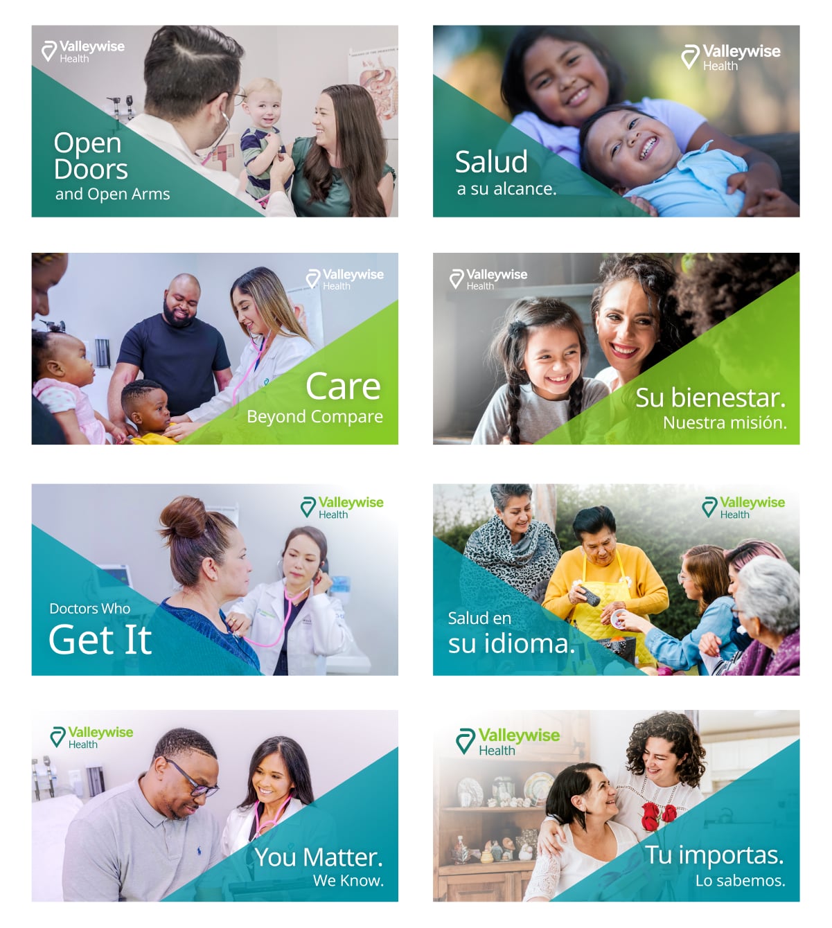
Usability testing feedback on the website was mixed; users found the bright, colorful brand colors as appealing, but the black and white photography and some of the models' expressions didn't instill a sense of "healthcare."
A round of unmoderated testing was performed to gather insights on how the branding could be refined to resonate emotionally more with both potential and current patients.
Process
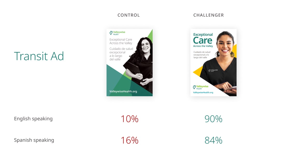
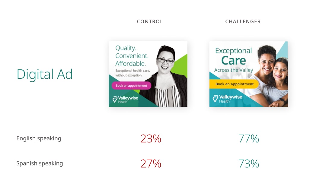
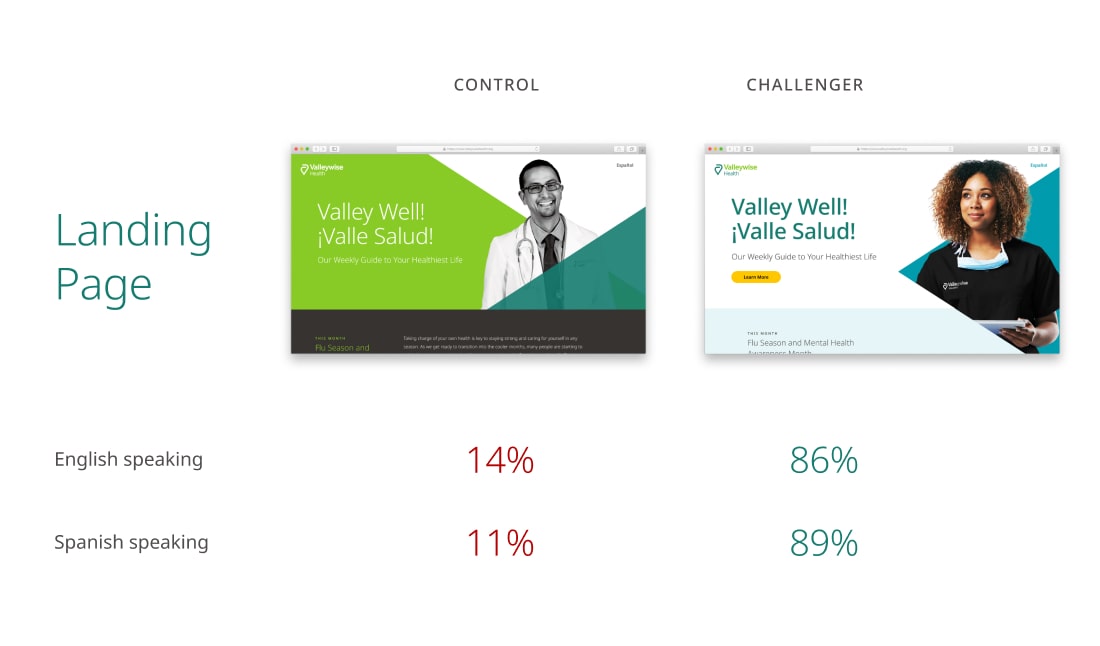
A survey was conducted with non-Valleywise patients across the Maricopa County area to test preferences on variations in black and white vs. color photography, brand color combinations, and typesetting.
Respondents were presented with three sets of designs, each with two options: the control and challenger. Respondents chose their preferred design, briefly explained why, and matched the preferred designs with positive, negative, and neutral word associations.
Challenger designs were based on website usability testing feedback and a proposed evolution of the Valleywise brand.
138
respondents
40%
Spanish speaking
60%
English speaking
95%
non Valleywise Patients
insights
Challenger designs received statistically significant preference in results for the following reasons in survey feedback:
01
Emotional connection with imagery, icons and overall visual design
Models, expression and overall color felt warmer and friendlier in the challenger design; Brand color application in challenger design was more appealing.
02
Clarity of writing
More concise copy is easier to digest and more focused. It helps keep the design minimal and clean, leading to a more professional feel.
03
Content organization and layout
Bolder, more dynamic typesetting with focus on keywords such as “Care” is more engaging. White space allows more focus on highlighted keywords.
04
Diverse, multi-generational photography
Color, family-oriented photography is more relatable as it better showcases diversity, the friendliness associated with healthcare, and that Valleywise values everyone’s unique health situations.
design evolution
With these new directions to help improve the brand visuals, I created an updated design concept for the website. Media campaign assets were then updated to reflect the new design direction and for an emotionally and visually stronger resonation with potential patients.
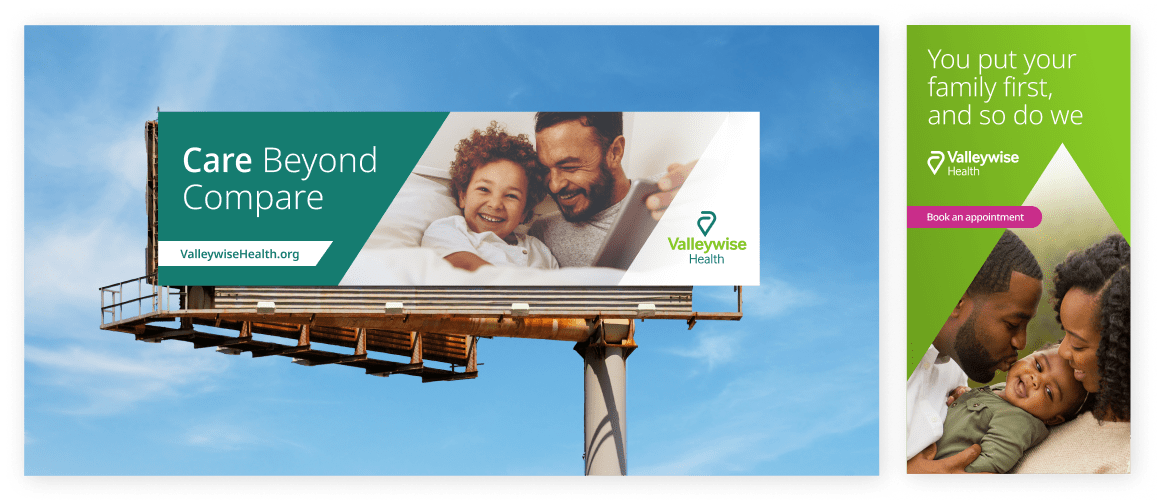
Ads created by Design Team
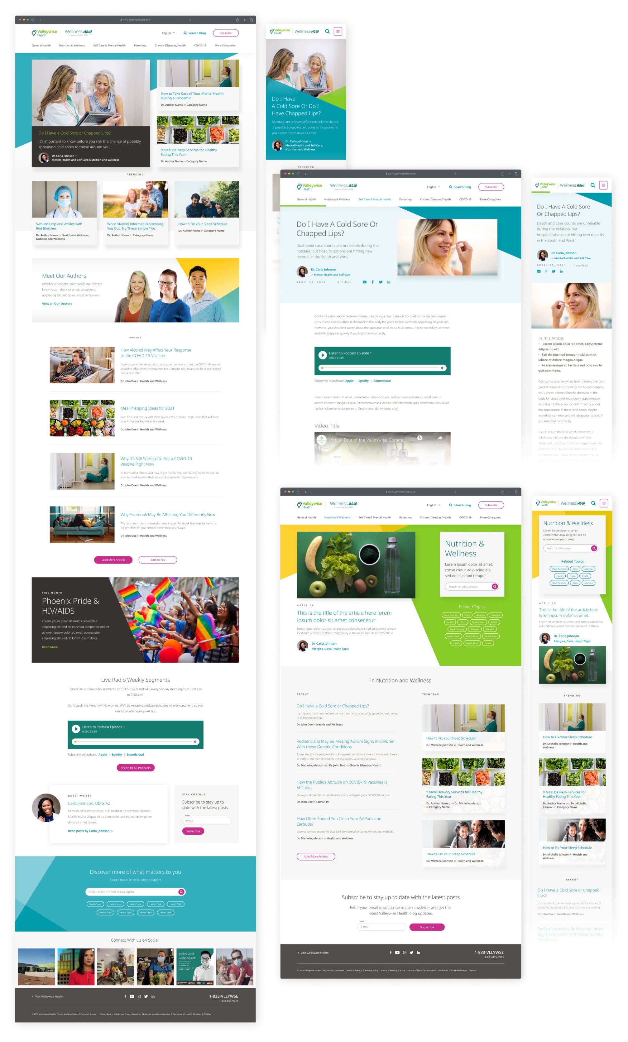
The Valleywise Health blog was also updated with the revised brand direction and an updated content strategy to:
- increase local traffic
- build brand awareness
- bring a focus on the doctors
- build the blog for content scalability and accommodate for different formats (like podcasts and videos)
- interlink to the the website's doctors, locations and services pages
- establish Valleywise Health as a thought leader in the local healthcare space
05 impact
takeaway and reflections
Keep a multi-cultural perspective in mind
During user testing, I saw first-hand how cultural values, health beliefs, and linguistic practices are important in the healthcare experience for Spanish-speaking audiences. Looking back, without a limited research budget and Spanish strategy, I would have conducted Spanish-speaking (and Latino specific) user research to create cultural personas specific to our primary audience to address these complexities in the experience.
It's okay to break the rules
With the newness of the initial rebrand from MIHS to Valleywise Health, it was difficult to convince stakeholders to adjust the design direction (even with the user testing results favoring a diversion from the original brand direction, and the original branding being done by another agency) so soon since the new website launch, with all the digital and print assets that had been created thus far.
I realized how important it is to conduct testing early and often in the process to get this invaluable user feedback/rationale – even if it's graphic design specific feedback, it can have great implications on the digital experience and raise further questions for structuring things like information architecture and content that are essential in the website journey.
next steps
The next evolution is to take the findings from our website and creative testing to push the boundaries of the brand elements in a fresh, vibrant but recognizable way; and to develop a creative, website content, and media strategy unique to our Hispanic audience that better aligns and communicates Valleywise Health’s commitment to the local Maricopa County residents and engage key audiences.
01
Further testing and monitoring
Back creative decision making with user research and monitored, iterative testing to ensure efficacy of cultural creative elements.
Integrate patient survey responses into the larger communication strategy. Optimize out-going survey efforts and ongoing follow up communication to improve the patient experience.
02
Write and design for our audience.
Frame major messages and creative (whether website or media) in a concise manner, with Hispanic culture and healthcare nuances in mind.
Bring diversity and cultural appreciation and understanding, including the Hispanic multi-generational family's role in healthcare.
03
Expand and iterate upon personas.
Establish new audience personas to reach and engage the AHCCCS audience and audience segments that are not reached by other health systems in the Valley: Hispanic, Refugee, African American, HIV, and women/children.
04
Future state features + functionality
- Online appointment creation
- SMS, mobile app or video conferencing with doctors to make users feel connected, and increase accessibility to healthcare
- Health profiles
- Patient access to medical records and/or patient ownership of records
- Medication reminders
- Filling prescriptions from SMS or mobile application
- Personalized recommendations based on symptom and monitored data from wearables
more work
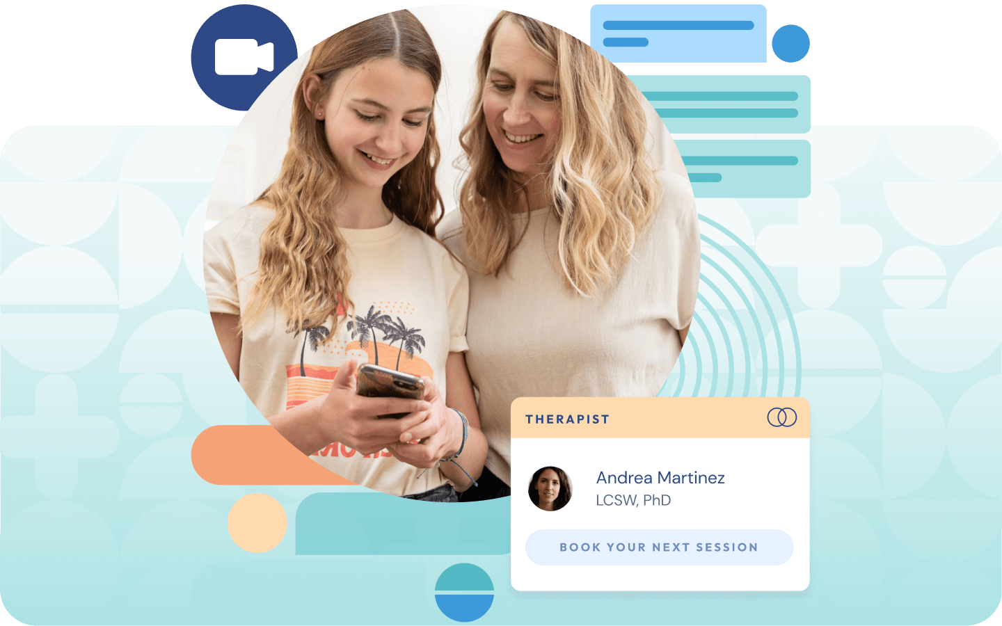
An end-to-end journey, from intake flows and consent models, to parent and teen experiences, to clinicial and operational workflows — ensuring safe, seamless access to therapy and psychiatry for teens and their families.
A museum game app enhancing visitor's experience while providing museum staff with real-time data.